I've also been busy trying to create a little graphic for this site. While I don't
love anything I've come up with so far, I think I could live with a few of them. So here's where you come in! I need you to pick which one you like best, ok? I might add more later, but so far these are the two that are in contention. Leave a comment with your choice!

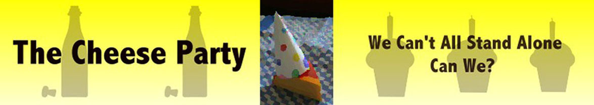
The first one is the simplest of the two. It says, 'Look at me, I am a happy, celebrating cheese!'

This second one, though, says 'Look at
us! We're happy, partying cheeses!'
Don't be afraid to tell me you hate them both. I'm looking for honesty here people. Don't let me down!
 The first one is the simplest of the two. It says, 'Look at me, I am a happy, celebrating cheese!'
 This second one, though, says 'Look at us! We're happy, partying cheeses!'
i really like the first one best...it has great color and isn't as busy as the second. It would be a great logo if you ever started a buisness. The first one seems like its telling a story without spelling it all out- plus when the next one comes, wouldn't you have to add another piece of cheese to the second pic?
ReplyDeleteLove it!
I like them both, but I like the second one better...probably because one of the cheeses looks like brie and I love brie...
ReplyDeleteI know...stupid reason...but there you have it.
I still like your head in the cheese one best.
ReplyDeleteDidn't help, did I?
Mmmm, I'm partial to the first one. Could be that I just like what it has to "say" better(who can resist a happy, celebrating cheese?), though, so my opinion isn't based strictly on how they look!
ReplyDeleteI like the first one. I can't explain it.
ReplyDeleteSo far, the first one is leading. I need more input! Where my peeps at?
ReplyDeleteI like the first one best - it is not as busy. Although, like the swiss miss, I like your head in the cheese better!
ReplyDeleteDefinitely No. 2. Cheese Party ... heee hee.
ReplyDeletea lonely cheese does not a party make
ReplyDelete